使用 Bootstrap 和 CSS 打造寫輪眼特效
分類
建立時間: 2023年12月18日 02:14
更新時間: 2023年12月18日 02:54
說明
在網路上看到一篇純 css 實現寫輪眼的特效,我將部分 css 轉換成 Bootstrap,並且進行了優化,進來感受痛苦吧!
預覽
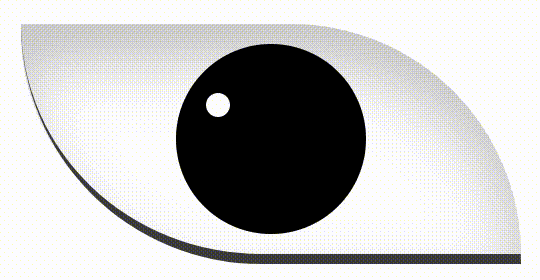
預覽 gif 播放速度有一點慢,實際上會播放的更快。
HTML
大致上我都有註解每個元素的功能,其他大部分都是 Bootstrap 的語法,我就不再贅述。
<div class="container">
    <div class="row justify-content-center">
        <div class="col-6 col-lg-4">
            <!-- 寫輪眼 -->
            <div class="bg-white mx-auto my-3 position-relative sharingan">
                <!-- 瞳孔 -->
                <div class="bg-black
                            position-absolute
                            rounded-circle
                            start-50
                            sharingan__pupil
                            top-50
                            translate-middle
                            z-1"></div>
                <!-- 勾玉所在的圈 -->
                <div class="border border-2 border-black position-absolute rounded-circle sharingan__ring z-2">
                    <!-- 三個勾玉 -->
                    <span class="bg-black position-absolute rounded-circle sharingan__magatama"></span>
                    <span class="bg-black position-absolute rounded-circle sharingan__magatama"></span>
                    <span class="bg-black position-absolute rounded-circle sharingan__magatama"></span>
                </div>
            </div>
        </div>
    </div>
</div>
CSS
建議將寫輪眼的 css 寫成一個檔案,以方便後續管理。
sharingan.css
/*
 * 寫輪眼主體
 */
.sharingan {
    border-bottom: 5px solid rgb(70, 70, 70);
    border-radius: 0 120px 0 120px;
    box-shadow: inset 0px 18px 30px 0px rgba(0, 0, 0, 0.2);
    height: 120px;
    width: 250px;
}

/*
 * 虹膜
 */
.sharingan::after {
    background-color: rgb(0, 0, 0);
    border-radius: 50%;
    border: 2px solid #000;
    content: '';
    height: 95px;
    left: 50%;
    position: absolute;
    top: 50%;
    transform: translate(-50%, -50%);
    width: 95px;
}

/*
 * 小白點
 */
.sharingan::before {
    background-color: rgb(255, 255, 255);
    border-radius: 50%;
    content: '';
    height: 12px;
    left: 37%;
    position: absolute;
    top: 30%;
    width: 12px;
    z-index: 10;
}

.sharingan:hover::after {
    animation: sharingan__turnRed .2s linear forwards;
}

/*
 * 勾玉
 */
.sharingan__magatama {
    height: 12px;
    left: 50%;
    opacity: 0;
    top: 50%;
    transform: translate(-50%, -50%) scale(0.1);
    width: 12px;
}

/*
 * 勾玉的逗號
 */
.sharingan__magatama::after {
    border-left: 4px solid rgb(0, 0, 0);
    border-radius: 50%;
    content: '';
    height: 16px;
    left: -1px;
    position: absolute;
    top: -4px;
    width: 14px;
    transform: rotate(4deg);
}

.sharingan:hover .sharingan__magatama:nth-child(1) {
    animation: sharingan__magatama1 .5s linear .5s forwards;
}

.sharingan:hover .sharingan__magatama:nth-child(2) {
    animation: sharingan__magatama2 .5s ease-in .5s forwards;
}

.sharingan:hover .sharingan__magatama:nth-child(3) {
    animation: sharingan__magatama3 .5s linear .5s forwards;
}

/*
 * 瞳孔
 */
.sharingan:hover .sharingan__pupil {
    animation: sharingan__dilatePupil .1s linear forwards;
}

/*
 * 勾玉外圈
 */
.sharingan__ring {
    height: 65px;
    left: 93px;
    opacity: 0;
    top: 26px;
    width: 65px;
}

.sharingan:hover .sharingan__ring {
    animation: sharingan__rotateRing .5s linear .5s forwards;
    opacity: 1;
}

/*
 * 瞳孔放大
 */
@keyframes sharingan__dilatePupil {
    100% {
        width: 20px;
        height: 20px;
    }
}

/*
 * 第1顆勾玉位置
 */
@keyframes sharingan__magatama1 {
    100% {
        left: 50%;
        opacity: 1;
        top: -9%;
        transform: scale(1) rotate(80deg);
    }
}

/*
 * 第2顆勾玉位置
 */
@keyframes sharingan__magatama2 {
    100% {
        left: -9%;
        opacity: 1;
        top: 60%;
        transform: scale(1) rotate(-60deg);
    }
}

/*
 * 第3顆勾玉位置
 */
@keyframes sharingan__magatama3 {
    100% {
        left: 85%;
        opacity: 1;
        top: 60%;
        transform: scale(1) rotate(180deg);
    }
}

/*
 * 旋轉整個勾玉圈,包含影響勾玉
 */
@keyframes sharingan__rotateRing {
    100% {
        transform: rotate(720deg);
    }
}

/*
 * 虹膜變色
 */
@keyframes sharingan__turnRed {
    100% {
        background-color: rgb(180, 25, 35);
    }
}
參考
觀看次數: 1475
csssharingan寫輪眼特效
一杯咖啡的力量,勝過千言萬語的感謝。
支持我一杯咖啡,讓我繼續創作優質內容,與您分享更多知識與樂趣!